UI SDK was announced by shadcn, the author of shadcn/ui, and shadcn/ui's own components don't come in a UI SDK version yet. So we put both libraries in one project and measured what happens. They ran together. Four things went wrong on the way, and each has a fix or a way around it below.
We make components for UI SDK, so we have a stake here. One of the four problems is in our own registry, and it is in the list with the others.
If UI SDK is new to you, read what UI SDK is and how to animate it first.
Does shadcn/ui support UI SDK yet?
No. UI SDK is a separate library: a beta from Vercel Labs, first published to npm on 12 November 2026 under the Apache-2.0 licence (launch post). shadcn CLI 4.23.0, the latest release on 16 November 2026, lets you pick one of three component libraries with --base: base (Base UI), radix or aria (React Aria). UI SDK isn't on the list. A new project made with the defaults gets Base UI, which has been the default since July 2026.
The two libraries still work side by side. Every number below comes from this project:
| Version | |
|---|---|
| Project | shadcn init -d (Next.js template, base-nova style) |
| shadcn CLI | 4.23.0 |
| Next.js / React | 16.4.5 / 19.3.1 |
| Tailwind CSS / tw-animate-css | 4.3.5 / 1.4.0 |
| Base UI | 1.9.0 |
| UI SDK | 0.1.0-beta.3, then repeated on 0.1.0-beta.5 |
| Browser | Chrome 157, headless, on macOS |
We added 14 shadcn components (Button, Dialog, Tabs, Select, Switch and nine more) and rendered them next to UI SDK's Dialog, Tabs, Switch and Button. tsc --noEmit reported no errors and next build passed.
How do you add UI SDK to a shadcn project?
Install @ui-sdk/react and @ui-sdk/core, then add @layer ui-sdk; as the first line of app/globals.css. That is the whole setup.
First the packages:
npm install @ui-sdk/react @ui-sdk/coreOn 16 November this installed 0.1.0-beta.3. Version 0.1.0-beta.5 was already published, under npm's beta tag, so ask for @ui-sdk/react@beta if you want the newest one. Our project already met UI SDK's requirements: React 19 and @types/react 19.2.10 or newer.
Then add one line at the very top of app/globals.css, above the Tailwind import:
@layer ui-sdk;

@import "tailwindcss";
@import "tw-animate-css";
@import "shadcn/tailwind.css";
UI SDK adds a little CSS of its own at runtime, such as the rule that hides a closed popup. A CSS layer that is declared first loses to everything declared after it, so your own styles win. UI SDK's styling guide explains the layer.
UI SDK components import from their own paths and need no provider:
import { Dialog, DialogBackdrop, DialogContent, DialogTitle, DialogTrigger } from "@ui-sdk/react/dialog"Which shadcn classes work on UI SDK parts?
Colour classes work unchanged, and so do the open, closed, checked, disabled and orientation state classes. The selected-tab class and the open-menu-trigger class need a new name.
bg-popover and text-popover-foreground are Tailwind utilities that read your theme variables, so it makes no difference which library rendered the element. A UI SDK dialog with shadcn's classes pasted on was 384px wide and centred at the same point as shadcn's own.
State classes depend on the attribute each library writes. We compared the classes in shadcn's component files with the attributes listed in UI SDK's docs:
| State | shadcn class (Base UI) | UI SDK attribute | Carries over? |
|---|---|---|---|
| Open or closed popup | data-open: data-closed: | data-open data-closed | Yes |
| Checked (Checkbox, Radio, Switch) | data-checked: data-unchecked: | data-checked data-unchecked | Yes |
| Disabled | data-disabled: | data-disabled | Yes |
| Orientation | data-horizontal: data-vertical: | data-orientation="horizontal" | Yes |
| Selected tab | data-active: | data-selected | No, write data-[selected]: |
| Trigger of an open menu | data-popup-open: | data-open | No, write data-open: |
We ran the popup, orientation and selected-tab rows in the browser. The other rows, including the menu trigger, come from reading shadcn's files and UI SDK's docs.
The part names differ as well. shadcn's DialogContent draws the overlay and the close button for you. UI SDK has you place DialogBackdrop and DialogClose yourself. TabsTrigger and TabsContent become TabsTab and TabsPanel.
data-selected: needs the bracket form
We expected the selected tab to need one change: data-active: becomes data-selected:. That did nothing. The selected tab's background stayed transparent.
The cause is in shadcn/tailwind.css, which every shadcn project imports. It redefines the data-selected: variant so it only matches an attribute with the value true:
@custom-variant data-selected {
  &:where([data-selected="true"]) {
    @slot;
  }
}
UI SDK writes the attribute with no value: data-selected="". So the variant never matches. The bracket form skips shadcn's override and matches the bare attribute:
<TabsTab
  value="account"
  className="rounded-md px-3 py-1 text-sm data-[selected]:bg-background data-[selected]:text-foreground"
>
  Account
</TabsTab>
With data-[selected]:bg-primary the selected tab took the primary colour. With data-selected:bg-primary it stayed transparent. Both results were the same on beta.3 and beta.5.
tw-animate-css on a UI SDK dialog
Opening works as it is. Closing needs one more class, data-closed:fill-mode-forwards, or the UI SDK dialog shows at full opacity for one frame after it fades out.
shadcn's dialog animates with tw-animate-css keyframes: data-open:animate-in data-open:fade-in-0 data-open:zoom-in-95 to enter, and data-closed:animate-out data-closed:fade-out-0 data-closed:zoom-out-95 to leave. We pasted those classes, untouched, onto UI SDK's DialogBackdrop and DialogContent.
Opening was identical. We read the dialog's opacity on every frame, and the UI SDK dialog followed the same curve as the Base UI one over the same seven frames.
On close, the dialog faded out, appeared again at full opacity for a single frame, and then left the page.
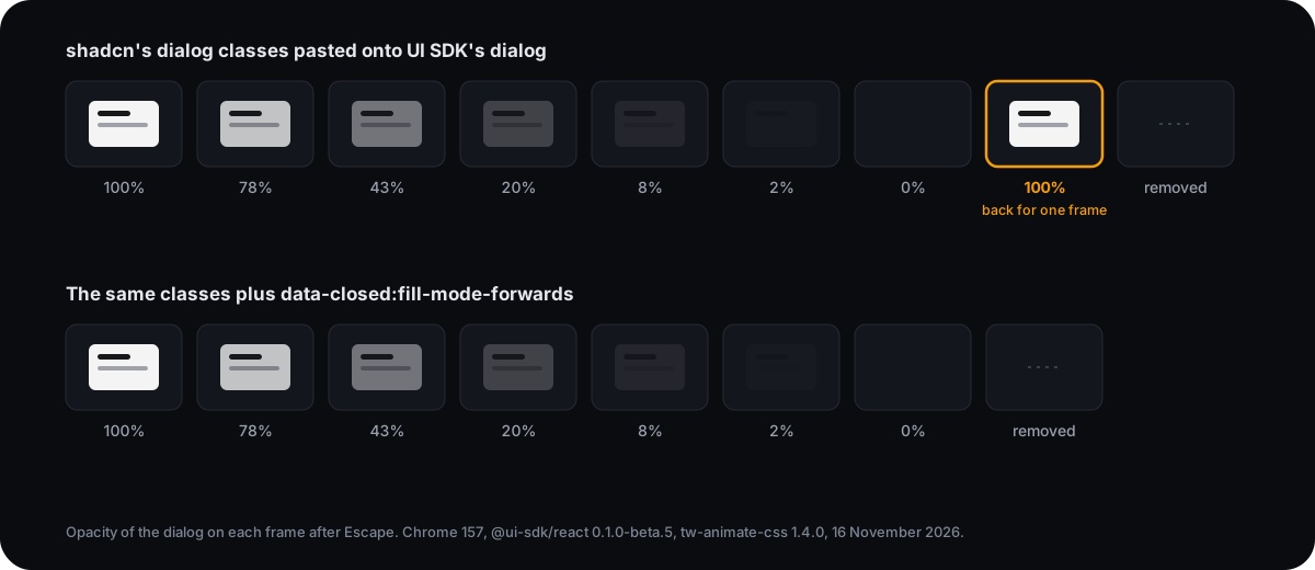
We checked this two ways: the computed opacity on each frame, and the frames Chrome drew, taken from a trace. The full-opacity frame showed up in 9 of 9 runs, six on beta.3 and three on beta.5. shadcn's own Base UI dialog, with the same classes, never showed it in 9 runs.
Our reading of the cause: a keyframe animation doesn't hold its last frame unless you ask it to. When animate-out ends, the dialog goes back to its normal styles. Base UI had removed its dialog by that frame. UI SDK's dialog was still in the page for one more frame, fully visible.
There are two fixes, and both passed.
The first keeps shadcn's classes and adds one. fill-mode-forwards is a tw-animate-css utility that sets animation-fill-mode, so the dialog holds the end of its exit animation until UI SDK removes it:
<DialogContent className="… data-closed:animate-out data-closed:fade-out-0 data-closed:zoom-out-95 data-closed:fill-mode-forwards">Put the same class on DialogBackdrop. With it, the extra frame was gone in 6 of 6 runs, three on each beta.
The second uses transitions, the way UI SDK's docs do. UI SDK puts data-starting-style on a popup for its first frame and data-ending-style while it leaves, and waits for the transition to finish:
<DialogContent className="… transition-[opacity,scale] duration-100 data-starting-style:scale-95 data-starting-style:opacity-0 data-ending-style:scale-95 data-ending-style:opacity-0">This version showed no extra frame in 9 runs. A transition ends on its final style, so there is no frame where the dialog can snap back. Use it for new code. Our UI SDK animation recipes are written this way.
UI SDK's web.css and dark mode in a shadcn project
We'd skip it. In our shadcn project, UI SDK's default stylesheet, @ui-sdk/core/web.css, moved shadcn's own Dialog off-centre and changed its Switch and Tabs. Its dark mode followed the operating system while the app's theme switch said otherwise.
UI SDK's docs suggest importing the file after Tailwind:
@import "@ui-sdk/core/web.css" layer(components);We did that and found two problems.
First, it restyles shadcn's own components. The file styles parts by their data-slot name, and shadcn's components carry data-slot names too. web.css has 230 distinct slot names. Our 14 shadcn components use 71, and 31 of them are the same, including button, switch, switch-thumb, tabs-list, dialog-content and select-trigger. After the import, shadcn's Dialog opened 128px right of centre and 161px low in a 1280 by 800 window, because its dialog-content part had picked up a margin from web.css. The UI SDK dialog that carried shadcn's classes moved as well. shadcn's Switch gained 2px of padding, which pushed its thumb outside the track, and a line appeared under its tabs list.
Second, its dark mode follows the operating system and ignores shadcn's theme switch. web.css chooses colours with light-dark(). Our Next.js build rewrote every light-dark() call into a rule that reads the operating system's setting. Lightning CSS does this so older browsers get the colours too. shadcn switches theme with a dark class on the page. The two disagree whenever a visitor picks a theme that differs from their system:
| System | Theme chosen in the app | Page | UI SDK's default button |
|---|---|---|---|
| Light | Light | Light | Light |
| Light | Dark | Dark | Light (mismatch) |
| Dark | Light | Light | Dark (mismatch) |
| Dark | Dark | Dark | Dark |
The token bridge
The theme problem has a short fix. web.css reads its colours from tokens named after shadcn's, with a --ui- prefix. Point each one at your shadcn token, anywhere after the theme in globals.css:
:root {
  --ui-background: var(--background);
  --ui-foreground: var(--foreground);
  --ui-muted: var(--muted);
  --ui-muted-foreground: var(--muted-foreground);
  --ui-border: var(--border);
  --ui-input: var(--input);
  --ui-primary: var(--primary);
  --ui-primary-foreground: var(--primary-foreground);
  --ui-destructive: var(--destructive);
  --ui-ring: var(--ring);
  --ui-radius: var(--radius);
}
With these 11 lines, UI SDK's button followed the app's theme in all four combinations. Its corners went from square to shadcn's 10px radius, and its Switch took the same track colour as shadcn's Switch in light and dark.
The picture below is the test page with the app in dark mode on a light system. The top row is shadcn's own components and the bottom row is UI SDK's, before the bridge on the left and after it on the right.
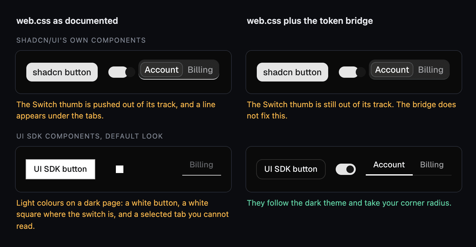
The bridge does nothing for the first problem. In the top row, shadcn's Switch thumb is out of place on both sides.
So in a shadcn project, skip web.css and style UI SDK parts with the classes you already use. If you import it for a quick start, add the bridge and then look at every shadcn component on your pages.
Can you install UI SDK components with the shadcn CLI?
Yes. A shadcn registry can ship components built on UI SDK, and the CLI installs UI SDK along with them. Check two things in a registry item first: where it writes its files and which UI SDK version it asks for. shadcn view prints both without installing anything:
npx shadcn@latest view @keyframery/tabsLook at each file's target and at dependencies. We tried two registries.
Our own registry, @keyframery, went first. npx shadcn@latest add @keyframery/tabs found it with no setup. It wrote three files, into components/keyframery/ and lib/, and left shadcn's components/ui/tabs.tsx alone. Both sets of tabs then built on one page.
The problem: in this test the item pinned UI SDK 0.1.0-beta.2, so the install moved our project back from beta.3 to beta.2. We reinstalled beta.5 afterwards and the tabs still type-checked and built. We have since moved the pin to 0.1.0-beta.9. If your project is on a newer release than the pin, run your UI SDK install again after adding one of our components. The installation guide has the rest.
The second was SPEC-01, a hardware-style kit from the shuding/spec-01 repository. Its slider item writes to components/ui/slider.tsx, the path shadcn's own slider uses. On 16 November it also asked for a UI SDK build (0.0.0-20261111125312.ga16c1d57) that npm doesn't have, so the install stopped at the dependency step and wrote nothing. shadcn's slider was untouched. Both things may have changed by the time you read this.
UI SDK is in beta and its releases come days apart, so expect registries to pin exact versions for a while.
The bundle cost of running both
A page with shadcn's Base UI dialog and UI SDK's dialog loaded 69.8 KB more gzipped JavaScript than a blank page. Each dialog alone added 36.8 KB and 33.4 KB, which comes to 70.2 KB, so the two libraries share almost no code.
These are the scripts each page loads in the production build:
| Page | Scripts, gzipped | Added to a blank page |
|---|---|---|
| Blank page | 172.1 KB | |
| shadcn Dialog (Base UI) | 208.9 KB | 36.8 KB |
| UI SDK Dialog | 205.5 KB | 33.4 KB |
| Both dialogs | 241.9 KB | 69.8 KB |
That is fine for a page that needs one component from each library. It is a reason to avoid shipping two of everything.
Should you move a shadcn project to UI SDK?
No. Nothing in shadcn/ui is deprecated, and UI SDK is a beta whose docs say its APIs may change. Keep your shadcn components. They work, and moving them means renaming parts and state classes for no gain your users would see.
Add UI SDK where shadcn/ui has no component. Color Picker, Image Cropper, Tree, Token Input, Rating and Number Input are in UI SDK and have no same-named component in shadcn's registry. We checked 17 UI SDK components against that registry and found none of them there.
When you add it, pin the exact version: write 0.1.0-beta.5 in package.json, without a caret. npm lists five betas between 12 and 15 November.
If you want UI SDK components that already animate, that is what we build. The tabs installed in this test came from Keyframery's components, and the theming page explains how they use shadcn's tokens.
How we tested, and what we didn't
We tested UI SDK 0.1.0-beta.3 and 0.1.0-beta.5 with shadcn CLI 4.23.0 and Next.js 16.4.5, in headless Chrome 157 on one Mac, on 16 November 2026.
A script opened and closed each dialog and read its computed styles on every animation frame. For the closing frame we also recorded the frames Chrome drew, with tracing turned on, and checked the pixels. We installed with pnpm, and the commands above are written for npm. The test pages and scripts aren't published with this post.
What this doesn't cover:
- shadcn projects on the Radix or React Aria base. We tested the default, Base UI.
- Vite and other build tools. The dark-mode result depends on how the build compiles
light-dark(). - Safari and Firefox.
- UI SDK components other than Dialog, Tabs, Switch and Button.
- Keyboard and screen-reader behaviour. We measured styling and animation only.
- A way to limit
web.cssto UI SDK parts, so it leaves shadcn's alone.
UI SDK changes quickly. Compare the versions in the table at the top with what you install before you rely on any of these results.
Questions
Does shadcn/ui use UI SDK?
Not as of 16 November 2026. The --base option of shadcn CLI 4.23.0 accepts base, radix and aria, and a new project with the defaults installs Base UI. UI SDK is a separate library that you add to the project yourself.
Can I use UI SDK and shadcn/ui in the same project?
Yes. We added @ui-sdk/react to a new shadcn project on Next.js 16.4.5 and rendered both libraries on one page. tsc reported no errors and next build passed. Almost nothing is shared between them, so a page that uses both dialogs loads both: 69.8 KB of gzipped scripts in our build, against 36.8 KB and 33.4 KB for each dialog alone.
Does tw-animate-css work with UI SDK components?
Entering works. With tw-animate-css 1.4.0 and shadcn's data-open:animate-in classes, a UI SDK 0.1.0-beta dialog faded and scaled in exactly like the Base UI one. Leaving needs one more class: without data-closed:fill-mode-forwards the UI SDK dialog showed at full opacity for one frame after its exit animation, in 9 of 9 runs.
Why does data-selected: do nothing on UI SDK tabs in my shadcn project?
The stylesheet shadcn adds to every project, shadcn/tailwind.css, redefines the data-selected: variant so it only matches data-selected="true". UI SDK renders the attribute with no value, data-selected="". Write data-[selected]: and Tailwind matches the bare attribute.
Does UI SDK's default look follow the shadcn dark mode switch?
Not in our Next.js build. @ui-sdk/core/web.css picks its colours with light-dark(), and the build compiled that into a prefers-color-scheme rule, so the colours followed the operating system. With the app switched to dark on a light system, UI SDK's button stayed white. Pointing the --ui-* tokens at shadcn's tokens fixed it in all four combinations.
Do I have to replace my shadcn/ui components to use UI SDK?
No. As of 16 November 2026 nothing in shadcn/ui is deprecated, and its components keep working on Base UI or Radix. Add UI SDK for the components shadcn/ui doesn't have, and pin the exact UI SDK version, such as 0.1.0-beta.5, while UI SDK is in beta.
Sources
- UI SDK docs: React installation
- UI SDK docs: Styling and Animation
- UI SDK docs: Dialog
- vercel-labs/ui on GitHub
- UI SDK docs: Introducing UI SDK
- shadcn on X: introducing UI SDK
- shadcn/ui docs: CLI
- shadcn/ui changelog, July 2026: Base UI as the Default
- shadcn/ui docs: Registry
- tw-animate-css on GitHub
- MDN: animation-fill-mode
- MDN: light-dark()
- Lightning CSS: transpilation (light-dark)
- shuding/spec-01 on GitHub