This guide explains what UI SDK ships and how it works, then gives you tested CSS to animate its components, with a live demo. We checked every claim against version 0.1.0-beta.2, the version the components on this site run on. If you only want the animation, skip to the recipes.
What is UI SDK?
UI SDK is a library of user-interface behaviors from Vercel Labs. Its README calls it "a library of behaviors for agents to build the next generation of user interfaces."
A behavior is one job a component has to do well. Examples are moving focus with the arrow keys, finding an option as you type, and placing a popup next to its button and closing it on Escape. UI SDK does those jobs, with the ARIA attributes screen readers need, and leaves the visual design to you.
The first public beta, 0.1.0-beta.1, reached npm on 12 November 2026, and 0.1.0-beta.2 followed a day later. The packages are Apache-2.0. The repository had about 4,700 stars when this was written, three days after launch.
Three things set it apart from the headless libraries most React developers already know:
- One core, five frameworks. The behaviors live in
@ui-sdk/core, which has no framework in it. Adapters bring it to React (@ui-sdk/react), Vue, Svelte, Solid and Web Components. - Behaviors first, components second. You can use the 55 components the React package ships, or build your own from the same behaviors the library uses internally.
- Agents as the main audience. The setup is a prompt you paste into your coding agent, and the docs ship inside the npm package for the agent to read.
What do you get in the box?
Install the React adapter and the core:
npm install @ui-sdk/react @ui-sdk/coreThe React package needs React 19 or newer; it declares react and react-dom >=19 as peer dependencies.
The component list has 55 entries in beta.2. You get the usual Dialog, Menu, Select, Tabs and Tooltip. You also get components other headless libraries often leave out, such as a Date Picker with ranges, an OTP Input, a Color Picker and an Image Cropper. There is a Tree, a Resizable layout, a Drawer you can drag from any edge, and a Waterfall chart for request timings.
Each component is imported from its own path, the same way Radix and Base UI work:
import { Tabs, TabsList, TabsPanel, TabsTab } from "@ui-sdk/react/tabs"Every part renders with a data-slot attribute, like tabs-tab, and state attributes, like data-selected or data-disabled. That is how you style it.
How do behaviors work?
A component in UI SDK is a primitive: state, the operations that change it, and the parts that render it. You describe one with definePrimitive from @ui-sdk/core, then turn it into components for your framework with createParts:
import { createParts } from "@ui-sdk/react/primitive"

const { Root: MuteButton } = createParts(muteButton, { root: "button" })
The Vue adapter has the same createParts call, so one primitive serves every framework.
Behaviors are the pieces a primitive is built from. The docs walk through an icon picker made from two of them:
createPopupwith the popover preset opens the picker beside its button, moves focus into the search field, and closes on Escape or an outside click.createRovingFocusgives the grid one Tab stop. The arrow keys move between icons, and the next Tab leaves.
Others include createSelection and createTypeahead.
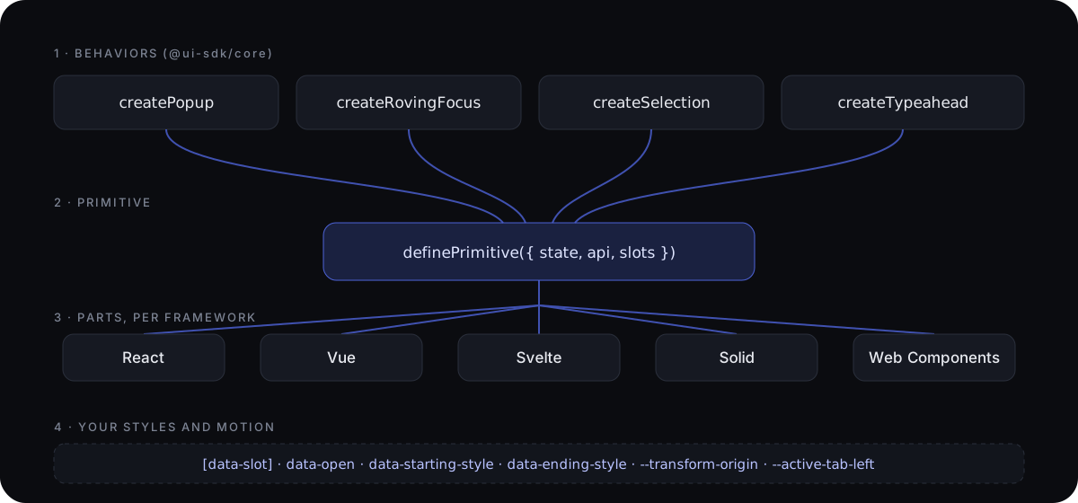
The README is frank about who writes this code: "Don't worry, you don't need to learn how to write this. Your agents will."
Why is it built for coding agents?
When an agent builds a custom component today, it usually rewrites focus handling, arrow-key navigation and screen-reader announcements from scratch, and small mistakes slip in. azukiazusa's write-up describes exactly that gap: a headless library only helps with the components it already ships. UI SDK's answer is to hand the agent tested behaviors and let it assemble the component.
The setup is aimed at that workflow:
- Add the skill:
npx skills add vercel-labs/ui --skill ui-sdk. - Tell the agent, in
AGENTS.md, to follow the skill and readnode_modules/@ui-sdk/react/docs/llms.txt. - Ask for the component you want.
The docs folder in the npm package is generated from the same source as the website, for the exact release you installed, so the agent reads the API of the version in your lockfile.
The second half is the agent as a user. createAgent from @ui-sdk/react/agent connects an agent to the UI SDK components on a page. agent.snapshot() lists the components, their state and the actions each one supports. agent.act() then calls an action through the component's API, so an agent can set a field's value in one call instead of clicking and typing like a person. Component authors decide which actions agents may call.
UI SDK vs Radix, Base UI and shadcn/ui
| UI SDK | Radix Primitives | Base UI | shadcn/ui | |
|---|---|---|---|---|
| What you get | Behaviors plus 55 unstyled components | Unstyled components | Unstyled components | Styled components you copy in |
| Frameworks | React, Vue, Svelte, Solid, Web Components | React | React | React |
| Main building block | Behavior (createPopup, createSelection and others) | Component | Component | Styled component |
| Agent tooling | Skill, docs bundled in the npm package, createAgent bridge | None built in | None built in | Skill and MCP server, installed separately |
| Status (15 November 2026) | Beta | Stable | Stable | Stable |
If you already use shadcn/ui, nothing forces a move. Its components sit on Radix or Base UI, and they keep working. UI SDK matters most if you build components shadcn/ui doesn't have, if you target more than React, or if agents write most of your UI code. We compared the two ways agents learn a component library, skills and MCP servers, in shadcn skill vs MCP server.
How do you style UI SDK components?
Parts render without styles. You target data-slot and the state attributes with plain CSS, CSS Modules or Tailwind. With Tailwind, attribute variants read naturally:
<Toggle className="rounded-md border px-2.5 py-1.5 data-pressed:bg-neutral-100 data-disabled:opacity-50">
  Bold
</Toggle>
A few behaviors need a little CSS of their own, such as keeping a closed popup hidden, so UI SDK adds it in a cascade layer named ui-sdk. Declare that layer at the top of your global stylesheet, above @import "tailwindcss" if you use Tailwind, so your styles win:
@layer ui-sdk;How do you animate UI SDK components?
UI SDK gives you the hooks and leaves the motion to you:
- Entry and exit. Popups, dialogs, tab panels and collapsible panels get
data-starting-styleon their first frame anddata-ending-stylewhile they leave. UI SDK keeps the part mounted until the exit transition finishes.data-closeddescribes the state but doesn't keep anything on the page, so put exit styles ondata-ending-style. - Origin. Popups expose
--transform-origin, the point on the button they open from. - Indicators. Tabs measure the selected tab into
--active-tab-left,--active-tab-widthand four more variables, and setdata-activation-directiontoleft,right,upordown. - Height. Collapsible and Accordion panels expose their measured height as
--collapsible-panel-heightand--accordion-panel-height.
The recipes below use those hooks. We tested each one in Chrome on @ui-sdk/react 0.1.0-beta.2 by sampling the computed styles frame by frame, with reduced motion off and on. Try them here; these are plain UI SDK components with nothing on them but this CSS:
@ui-sdk/react components with only the CSS from this section. Turn on reduced motion in your system settings and the same changes happen at once.The whole stylesheet is one file, ui-sdk-motion.css, MIT licensed. Import it after your @layer ui-sdk; line.
Shared timings
Put durations and easings in variables, so the whole app moves at one pace and you can retune it in one place.
:root {
  --motion-fast: 150ms;
  --motion-base: 220ms;
  --ease-out: cubic-bezier(0.22, 1, 0.36, 1);
  --ease-spring: cubic-bezier(0.34, 1.4, 0.64, 1);
}
Menus, popovers, selects and tooltips
Each popup grows out of the button that opened them and shrinks back into it. The same rule covers every popup part. Keyframery's animated Menu, Popover, Select and Tooltip start from this rule and add a gliding highlight.
:is(
  [data-slot="menu-content"],
  [data-slot="popover-content"],
  [data-slot="select-content"],
  [data-slot="combobox-content"],
  [data-slot="hover-card-content"],
  [data-slot="tooltip-content"]
) {
  transform-origin: var(--transform-origin);
  transition:
    opacity var(--motion-fast) var(--ease-out),
    scale var(--motion-fast) var(--ease-out);

  &:is([data-starting-style], [data-ending-style]) {
    opacity: 0;
    scale: 0.95;
  }
}
Dialogs
The page behind dims and the dialog rises into place. The dialog uses transform on purpose: if you center it with Tailwind's -translate-x-1/2, that sets the separate translate property, and a recipe that animated translate would knock the dialog sideways as it opens. For a finished version with staggered contents, see Keyframery's animated Dialog.
[data-slot="dialog-backdrop"] {
  transition: opacity var(--motion-base) var(--ease-out);

  &:is([data-starting-style], [data-ending-style]) {
    opacity: 0;
  }
}

[data-slot="dialog-content"] {
  transition:
    opacity var(--motion-base) var(--ease-out),
    transform var(--motion-base) var(--ease-out);

  &:is([data-starting-style], [data-ending-style]) {
    opacity: 0;
    transform: translateY(12px) scale(0.97);
  }
}
Tab indicator, and the first-click catch
The indicator follows the measured variables, with a small spring. Keyframery's animated Tabs ship this with the first-click fix already in.
[data-slot="tabs-list"] {
  position: relative;
}

[data-slot="tabs-indicator"] {
  position: absolute;
  top: var(--active-tab-top);
  left: var(--active-tab-left);
  width: var(--active-tab-width);
  height: var(--active-tab-height);
  transition:
    left var(--motion-base) var(--ease-spring),
    top var(--motion-base) var(--ease-spring),
    width var(--motion-base) var(--ease-spring),
    height var(--motion-base) var(--ease-spring);
}
UI SDK's docs add one more rule, &[data-activation-direction="none"] { transition: none; }, so the indicator doesn't animate into its first position. In our tests that rule made the first click jump. The attribute changes from none to right in the same frame as the position, and a browser only animates a change when the transition was already switched on before it. Leave the rule out. Before UI SDK measures, the indicator's position is auto, which never animates, so the first placement stays still anyway. We checked both: no movement on load, and a slide on the first click.
Tab panels that slide from the side you moved toward
Stack the panels in one grid cell so the old and new panel overlap while they cross, then pick the direction from data-activation-direction.
.tab-panels {
  display: grid;

  & > [data-slot="tabs-panel"] {
    grid-area: 1 / 1;
    transition:
      opacity var(--motion-base) var(--ease-out),
      translate var(--motion-base) var(--ease-out);
  }

  & > [data-slot="tabs-panel"][data-starting-style] {
    opacity: 0;
    &[data-activation-direction="right"] { translate: 16px 0; }
    &[data-activation-direction="left"] { translate: -16px 0; }
  }

  & > [data-slot="tabs-panel"][data-ending-style] {
    opacity: 0;
    &[data-activation-direction="right"] { translate: -16px 0; }
    &[data-activation-direction="left"] { translate: 16px 0; }
  }
}
Wrap your TabsPanels in <div className="tab-panels">. The full file also covers up and down for vertical tabs.
Collapsible and Accordion panels
Animate the measured height between zero and the content's height. Swap collapsible for accordion in both names for Accordion. The finished versions are Keyframery's animated Collapsible and Accordion.
[data-slot="collapsible-panel"] {
  height: var(--collapsible-panel-height);
  overflow: hidden;
  transition: height var(--motion-base) var(--ease-out);

  &:is([data-starting-style], [data-ending-style]) {
    height: 0;
  }
}
Reduced motion
Some people get dizzy or distracted from interface motion and turn it off in their system settings. The WCAG guidance on animation from interactions asks for a way to turn non-essential motion off, and prefers-reduced-motion tells you when they have.
@media (prefers-reduced-motion: reduce) {
  [data-slot] {
    transition-duration: 0.01ms !important;
    animation-duration: 0.01ms !important;
  }
}
The near-zero duration matters. With transition: none, no transitionend event fires; with 0.01ms it does, and the exit finishes at once. In our tests every part above changed in one or two frames with reduced motion on, and closed popups and dialogs still left the page.
Going further
These six recipes cover the parts most apps open and close all day. A full motion system has more: numbers that roll to their new value, checkmarks that draw, menu items that arrive one after another, and a calendar month that slides in from the side you clicked. We packaged all of that as Keyframery, 60 components for UI SDK with the motion written in plain CSS, which keep UI SDK's parts and props so you change one import. The installation guide has the details.
Should you use UI SDK now?
It is three days old and labelled beta, and the docs say some APIs may still change. Two releases shipped in the first two days. That suggests three sensible uses today:
- Prototypes and internal tools, where an API change costs an afternoon.
- Agent-heavy codebases, where the skill and bundled docs save the most time.
- Components your current library lacks, built from UI SDK's behaviors while the rest of your app stays where it is.
For a production design system with many contributors, pin the exact version (0.1.0-beta.2 at the time of writing), read the changelog before each upgrade, and keep an eye on the GitHub repository for the first stable release.
The quickest way to judge it is to try one component you need this week. Install the two packages, add the skill, and ask your agent to build it.
Questions
Who makes UI SDK?
Vercel Labs. The source is on GitHub at vercel-labs/ui and the docs are at ui-sdk.dev. It is in beta, and the docs say some APIs may still change.
Is UI SDK free to use?
Yes. The npm packages are licensed Apache-2.0. The docs also note that the beta is covered by Vercel's beta terms, so read those before you depend on it in production.
Is UI SDK a replacement for shadcn/ui?
Not directly. shadcn/ui gives you styled components you copy into your project. UI SDK gives you unstyled behaviors and components, and you, or your agent, add the styles. The two can sit side by side: a shadcn-style registry can ship components built on UI SDK.
How is UI SDK different from Radix or Base UI?
Radix Primitives and Base UI ship a fixed set of headless components. UI SDK ships components too, but its main unit is the behavior, such as createPopup, createSelection or createTypeahead, which an agent combines into components the library never shipped. It also runs on five frameworks from one core, and it includes an agent bridge for operating the UI.
Does UI SDK animate components?
It gives you the hooks, not the motion. Popup content gets data-starting-style before it enters and data-ending-style while it leaves, and stays mounted until its exit transition ends. Collapsible can animate its height. The transitions themselves are CSS you write, or a library you add.
How do I animate UI SDK components?
Target each part's data-slot with CSS. Put the hidden state on data-starting-style and data-ending-style and add a transition, and UI SDK keeps the part mounted until the exit finishes. Use --transform-origin for popups, the --active-tab-* variables for tab indicators and --collapsible-panel-height for panels. The full tested stylesheet is at keyframery.com/blog/vercel-ui-sdk/ui-sdk-motion.css.
Which React version does UI SDK need?
React 19 or newer. The @ui-sdk/react package declares react and react-dom >=19 as peer dependencies.